Introduction
Your homepage is the virtual handshake of your website. It’s the first impression visitors get when they land on your Showit website, and it can make or break their decision to stay and explore further. If you’re aiming to design a high-converting homepage on Showit, you’re in the right place. This guide will walk you through the best practices—step by step—to create a homepage that not only looks stunning but also turns visitors into loyal customers or subscribers.
Pin this for later
1. Understand Your Target Audience Before Designing
Before you dive into the creative process, take a moment to think about who you’re designing for. A homepage that converts well is one that resonates deeply with its target audience. Use long-tail SEO keywords that align with their needs and ensure your content speaks directly to them.
A clear understanding of your audience helps you craft a homepage that:
- Speaks their language.
- Addresses their pain points.
- Highlights the benefits of your products or services.
When you know your audience, you’ll also know what design elements, tone of voice, and call-to-actions (CTAs) will grab their attention.
- Research Your Ideal Audience: Create a detailed customer persona.
- Define Their Problems: Understand what they’re looking for when they visit your website.
- Speak Their Language: Use tone and words that resonate with their emotions.
- Highlight Their Benefits: Focus on what they’ll gain.
Pro Tip: Use surveys or customer interviews to gain deeper insights into your target audience. Tools like Google Analytics can also reveal user behavior on your existing site.
Want easy, practical content tips to grow your business? Join my weekly email list for Canva tricks, new social media updates, and simple strategies that actually work.
2. Use an Engaging Above-the-Fold Section
The “above-the-fold” section is the part of your homepage that users see before scrolling. This space is prime real estate for grabbing attention and clearly communicating your value proposition.
A great above-the-fold section should:
- Feature a captivating headline that includes a relevant long-tail keyword.
- Use high-quality visuals that evoke trust and professionalism.
- Include a concise tagline or subheading that explains your offer.
- Have a clear call-to-action button (e.g., “Get Started” or “Learn More”).
Make sure it’s easy to read and visually appealing. Use whitespace effectively to ensure your message doesn’t feel cluttered or overwhelming.
- Strong Headline: Focus on a compelling promise or unique benefit.
- Subheadline: Offer a little more detail to entice curiosity.
- Visual Appeal: Use Showit’s drag-and-drop capabilities to include videos or high-quality images.
- Actionable CTA: Have one primary CTA that stands out.
Pro Tip: Test different versions of your above-the-fold content to see which headline, image, or CTA performs best. A/B testing can give you valuable insights into what works for your audience.
3. Keep Your Navigation Simple and Clear
Your homepage navigation acts as a roadmap for visitors. If it’s confusing or overwhelming, users are likely to leave without exploring further. Showit makes it easy to create sleek and intuitive navigation menus—use that to your advantage.
Simplified navigation ensures that:
- Visitors can quickly find the information they need.
- The user journey flows seamlessly.
- Your most important pages (e.g., Services, About, Blog) are easily accessible.
Stick to a minimal number of menu items and group them logically. Prioritize clarity and ensure all navigation links work properly on desktop and mobile.
- Use Descriptive Labels: Avoid generic terms like “Stuff” or “Things.” Be specific.
- Mobile Optimization: Showit’s mobile-friendly design ensures a smooth experience.
- Limit Items: Keep the number of menu items to 5-7.
- Include a Search Function: If you have a larger website, add a search bar.
Pro Tip: Use sticky navigation so the menu follows users as they scroll. This feature is especially effective for long homepages.
4. Showcase Your Unique Selling Proposition (USP)
What sets you apart from the competition? Your unique selling proposition (USP) should be prominently displayed on your homepage. It tells visitors why they should choose you over others in your niche.
A strong USP:
- Builds trust and credibility.
- Highlights your expertise or unique approach.
- Connects with your audience on a deeper level.
Your USP can be showcased through a combination of text, visuals, and testimonials. Use bold fonts for emphasis and include long-tail SEO keywords that reflect your niche expertise.
- Highlight Benefits: Focus on how your product/service solves a problem.
- Be Specific: Avoid vague statements like “We’re the best.”
- Use Testimonials: Include customer reviews that reinforce your USP.
- Leverage Visuals: Use Showit’s design flexibility to create custom graphics.
Pro Tip: Add a video explaining your USP. Videos are highly engaging and help to establish a personal connection.
5. Incorporate Social Proof
Social proof, such as testimonials, reviews, or case studies, can significantly increase conversions by establishing trust. When visitors see others vouching for your brand, they’re more likely to take action.
Effective social proof includes:
- Real customer testimonials with names and photos.
- Logos of well-known brands you’ve worked with.
- Case studies or statistics showcasing your results.
- Awards or certifications to establish authority.
Place your social proof strategically throughout the homepage to build credibility as users scroll.
- Testimonials: Use short, impactful quotes.
- Numbers: Showcase metrics like “100+ happy clients” or “5-star rating.”
- Video Reviews: If available, add video testimonials for more authenticity.
- Media Mentions: Highlight any press coverage or features.
Pro Tip: Use Showit’s design features to create a dedicated carousel or grid for testimonials, making them visually appealing and easy to navigate.
Save this for later
6. Optimize for Mobile Users
A mobile-friendly design isn’t optional—it’s a must. Showit’s platform allows you to create fully responsive designs, but it’s up to you to optimize the layout for small screens.
Mobile optimization ensures:
- Faster load times.
- A seamless user experience on any device.
- Higher rankings on search engines (Google prioritizes mobile-friendly websites).
Test your homepage on different devices and make adjustments to ensure text is legible, buttons are easy to tap, and images are correctly scaled.
- Use Larger Fonts: Ensure readability without zooming.
- Simplify Navigation: Use a hamburger menu.
- Optimize Images: Compress images to reduce loading time.
- Test Responsiveness: Preview your design in Showit’s mobile editor.
Pro Tip: Use Google’s Mobile-Friendly Test tool to check how your homepage performs on mobile devices.
7. Write Compelling Copy
The words on your homepage are just as important as the visuals. Clear, persuasive, and benefit-driven copy can turn visitors into leads or customers.
Your homepage copy should:
- Address your audience’s needs and concerns.
- Use long-tail SEO keywords naturally.
- Include action-oriented language to guide users.
- Be concise and to the point.
Focus on highlighting the value of your offerings while maintaining a friendly and approachable tone.
- Headline: Make it benefit-driven.
- Subheadings: Break up content for better readability.
- Body Text: Use bullet points to make information digestible.
- CTAs: Use action verbs like “Start,” “Discover,” or “Get.”
Pro Tip: Read your copy out loud to ensure it flows naturally and resonates with your audience.
8. Include Clear Calls-to-Action (CTAs)
A homepage without CTAs is like a store without checkout counters. CTAs guide your visitors toward the actions you want them to take, whether it’s signing up for a newsletter, purchasing a product, or scheduling a consultation.
To make your CTAs effective:
- Use bold and contrasting colors.
- Keep the text simple and action-focused.
- Place them strategically throughout the page.
- Ensure they’re easy to click on all devices.
Each section of your homepage should have a relevant CTA that aligns with the user’s journey.
- Primary CTA: Highlight the main action you want users to take.
- Secondary CTA: Offer an alternative for users not ready to commit (e.g., “Learn More”).
- Repeat CTAs: Reinforce them at the top, middle, and bottom of the page.
- Make Them Stand Out: Use Showit’s color customization tools.
Pro Tip: Use action-oriented phrases like “Download the Free Guide” or “Start Your Free Trial Today” to create urgency.
9. Prioritize Speed and Performance
A slow-loading homepage can drive visitors away before they even see your content. Speed is crucial for both user experience and SEO.
To optimize your homepage’s performance:
- Compress images without sacrificing quality.
- Minimize animations that slow down load times.
- Use Showit’s built-in performance tools.
- Ensure all links and buttons are functional.
Fast-loading pages not only improve user retention but also help your site rank higher in search engine results.
- Image Optimization: Use tools like TinyPNG.
- Simplify Animations: Avoid excessive motion effects.
- Test Load Speed: Use tools like Google PageSpeed Insights.
- Limit Plugins: Use only essential third-party integrations.
Pro Tip: Host your videos on external platforms like YouTube or Vimeo to reduce strain on your site’s loading time.
10. Test, Iterate, and Improve
A high-converting homepage isn’t built overnight. Regular testing and improvements are essential to ensure it stays effective.
To optimize your homepage over time:
- Monitor user behavior with tools like Hotjar.
- Analyze conversion rates to identify drop-off points.
- Conduct A/B testing on headlines, CTAs, and visuals.
- Gather feedback from actual users.
Iterate based on data and keep refining your design to align with evolving user preferences.
- Use Analytics: Track performance metrics.
- Gather Feedback: Ask users what they liked or disliked.
- Update Regularly: Refresh content and visuals periodically.
- Test Variations: Experiment with small changes to see big results.
Pro Tip: Schedule quarterly reviews of your homepage to ensure it remains aligned with your business goals and audience needs.
Wrapping It Up
By following these best practices, you can design a Showit homepage that not only looks fantastic but also drives results. Remember, a high-converting homepage combines stunning visuals, user-friendly design, and strategic content—all tailored to your audience. With Showit’s flexible platform, the possibilities are endless. Happy designing!
Loved This Post? Save It for Later!
And hey! If this post helped you, don’t forget to pin it to one of your boards so you can revisit it anytime. And more small business owners and creators can discover these helpful tips. Every save and share genuinely supports my work, and I’m grateful for it! Thank you!

WANT TO MASTER CANVA LIKE A PRO?
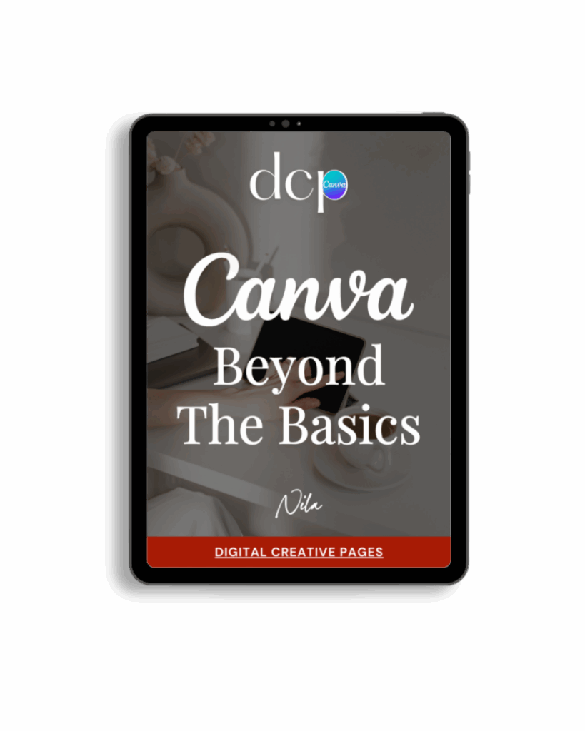
If you’re ready to move beyond basic designs and unlock Canva’s most powerful features, my book Canva – Beyond the Basics is for you.
Learn advanced workflows, time-saving hacks, and features like brand templates that busy entrepreneurs need to create professional content faster. It’s designed for anyone who wants to work smarter, not harder.
TEMPLATES FOR ENTREPRENEURS
No time to design from scratch? My Pinterest Templates are created with strategy, structure, and your brand in mind.
Pick your style: Modern Minimalist | Soft Storytelling | Entrepreneur-Friendly Layouts
For the cost of a latte, get them here → DCP Shop → $5
MY TOP POSTS
My INTRODUCER post – check out why I chose Showit as my website builder here
Use my affiliate code DCP to get one 1.5 months free on Showit
Get all the resources for your online business growth and Pinterest marketing without breaking the bank from my DCP Shop here
By signing up for my freebies, you are agreeing that I can use your email address to market to you. You can unsubscribe from marketing emails at any time by using the link in my emails.
Previous post
next post
Search + Enter
meet nila
Hi. I am
Nila
Beta reader, book editor, Pinterest manager, Showit VA
I’m a beta reader and book editor and PA for authors, specializing in story clarity and developmental feedback. I run a sustainable online business that keeps working for me 24/7.
Along with this, I offer Pinterest management for overwhelmed creatives and entrepreneurs and set up and customize Showit templates when the tech side gets too overwhelming.
My Shop
Buy now
i need it
Free Stuff
get the goods
check it out
My Favorites
apps + Tools
Yes, please
Handpicked Links
Excited to get started? Me too!
i can't wait to
Connect with you
Let's discuss how best I can help you and your business
find your way around
about
for authors
Showit
shop
Blog
freebies
Contact
elsewhere
X
Copyright © 2024 - 2026 Digital Creative Pages | All Rights Reserved | Terms & Conditions | Privacy Policy
Website Template by Digital Creative Pages.
Photos by Styled Stock Society
Subscribe here for weekly Canva & Social Media tips and 10% off in my shop

