Introduction
Hey there, Instagram enthusiasts! Ready to take your Instagram game to the next level? A cohesive Instagram aesthetic is your ticket to a visually stunning profile that attracts and engages followers. In this guide, we’ll walk you through the steps to develop a consistent look and feel for your profile, from choosing color schemes and filters to planning your grid layout. Let’s dive in and make your Instagram feed a visual delight!
Pin this for later
1. Understand Your Brand
Before diving into the aesthetics, it’s crucial to understand your brand identity. Ask yourself:
- What message do you want to convey? Your Instagram profile should reflect the core message of your brand. Are you promoting a lifestyle, selling products, or providing a service?
- Who is your target audience? Knowing your audience helps tailor your content to their preferences. Are they young professionals, fitness enthusiasts, fashion lovers, or tech geeks?
- What emotions do you want your audience to feel when they see your posts? Do you want them to feel inspired, happy, motivated, or relaxed?
By answering these questions, you can define a clear vision for your Instagram profile. This clarity ensures that your visual and textual content aligns with your brand’s identity and values.
Related Post: The Best Ways To Grow Profitable Businesses On Instagram
2. Choose A Color Scheme
Color plays a significant role in creating a cohesive aesthetic. Here’s how to pick the perfect color scheme:
- Brand Colors: Start with your brand colors. Consistency across all platforms is key. For instance, if your brand colors are blue and white, try to incorporate these colors into your Instagram posts.
- Mood and Tone: Decide on the mood you want to set—warm, cool, neutral, vibrant? For example, warm tones can evoke feelings of coziness and comfort, while cool tones can convey calmness and professionalism.
Tools to Help: Use tools like Adobe Color or Coolors to explore and create your color palette. These tools allow you to experiment with different combinations and find the perfect palette for your brand.
Related Post: How To Use Storytelling Hooks In Social Media Content
Want easy, practical content tips to grow your business? Join my weekly email list for Canva tricks, new social media updates, and simple strategies that actually work.
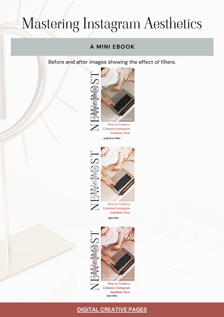
3. Select Your Filters
Filters can unify your photos and create a consistent look. Some tips:
- Consistent Use: Stick to one or two filters to maintain uniformity. This helps in creating a cohesive look across all your posts.
- Adjust Settings: Customize filter settings to suit your color scheme and style. Sometimes, minor adjustments in brightness, contrast, or saturation can make a big difference.
- Apps to Try: Explore apps like VSCO, Lightroom, and A Color Story for advanced editing options. These apps offer a variety of filters and editing tools that can help you achieve your desired look.
4. Plan Your Gril Layout
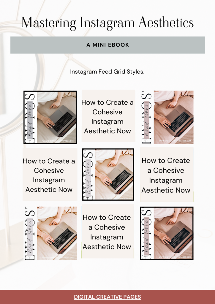
A well-planned grid layout makes your profile visually appealing. Consider these layouts:
- Checkerboard: Alternate between two types of posts, like quotes and photos. This creates a visually appealing contrast and balance.
- Rows or Columns: Dedicate rows or columns to specific themes or colors. For example, you could use one row for product shots and another for customer testimonials.
- Diagonal: Create a diagonal flow by posting similar images or colors diagonally. This layout can give a dynamic and interesting look to your feed.
- Tools for Planning: Use apps like Planoly, UNUM, or Preview to visualize and plan your grid layout. These tools allow you to see how your posts will look together before you publish them.
5. Be Consistent With Typography
Typography is another element that contributes to your aesthetic:
- Font Choices: Select fonts that align with your brand identity. If your brand is modern and sleek, choose clean, sans-serif fonts. For a more traditional look, serif fonts might be appropriate.
- Text Placement: Be consistent with where and how you place text on your images. For example, always placing text in the bottom right corner can become a recognizable part of your brand.
- Tools for Typography: Canva and Over are great tools for adding stylish text to your images. These apps offer a wide range of fonts and design elements to enhance your posts.
6. Curate Your Content
Content curation is key to maintaining a cohesive aesthetic:
- Content Themes: Decide on content themes that align with your brand. These could include behind-the-scenes shots, product highlights, user-generated content, or lifestyle images.
- High-Quality Images: Use high-resolution images for a professional look. Blurry or pixelated images can detract from your aesthetic.
- User-Generated Content: Encourage followers to share content that fits your aesthetic. Reposting user-generated content not only fills your feed but also engages your audience and builds community.
7. Use Cohesive Captions
Captions can enhance your visual aesthetic:
- Tone of Voice: Maintain a consistent tone that reflects your brand personality. Whether it’s playful, professional, or inspirational, consistency is key.
- Hashtag Strategy: Use relevant and branded hashtags to increase visibility. Create a list of hashtags that are relevant to your niche and rotate them to reach a wider audience.
- Engagement: Ask questions and encourage comments to boost engagement. Engaging captions prompt your followers to interact with your posts, increasing visibility.
These Storytelling hooks that help your audience show the effects of your products or services are the ones that are working now this year. Use them and grow your account and book more clients/sales.
8. Monitor And Adjust
Regularly review your profile to ensure consistency:
- Analyze Performance: Use Instagram Insights to track what works best. Look at metrics like engagement, reach, and follower growth to see which types of posts resonate most with your audience.
- Stay Updated: Keep up with trends and adjust your strategy accordingly. Social media trends can change quickly, so it’s important to stay flexible and adapt.
- Feedback: Listen to your audience and adapt based on their feedback. Comments and direct messages can provide valuable insights into what your followers like or dislike.
9. Tools And Apps To Enhance Your Aesthetic
- VSCO: For consistent filters and advanced photo editing.
- Lightroom: For professional-grade photo editing and presets.
- Planoly: For planning and scheduling your posts.
- Canva: For creating branded graphics and adding text to images.
- UNUM: For visualizing and organizing your Instagram grid.
10. Showcase Your Unique Style
Your Instagram aesthetic should reflect your unique style:
- Personal Touch: Add elements that showcase your personality. Whether it’s behind-the-scenes content or personal stories, make your profile uniquely yours.
- Consistency vs. Variety: While consistency is key, don’t be afraid to mix things up occasionally to keep your feed interesting. Introducing new content types or themes can keep your audience engaged.
- Be Authentic: Authenticity resonates with audiences, so stay true to yourself and your brand. Authentic content builds trust and loyalty among your followers.
Get the free Mastering Instagram Aesthetics Guide here!
Conclusion
Creating a cohesive Instagram aesthetic may seem daunting, but with these steps, you’ll be well on your way to a stunning profile that attracts and retains followers. Remember, consistency is key! Happy Instagramming!
Loved This Post? Save It for Later!
And hey—if this post helped you, don’t forget to pin it to one of your boards so you can revisit it anytime. And more small business owners and creators can discover these helpful tips. Every save and share genuinely supports my work, and I’m grateful for it! Thank you!
MY TOP POSTS
- 15 Small Business Ideas To make You Rich
- Social Media Marketing That Will Make Your Business Soar
- Instagram Reels Ideas To Boost Engagement And Followers
- Mastering Instagram Reels
- SEO Keywords – What Are They And How To Find Them
WANT TO MASTER CANVA LIKE A PRO?
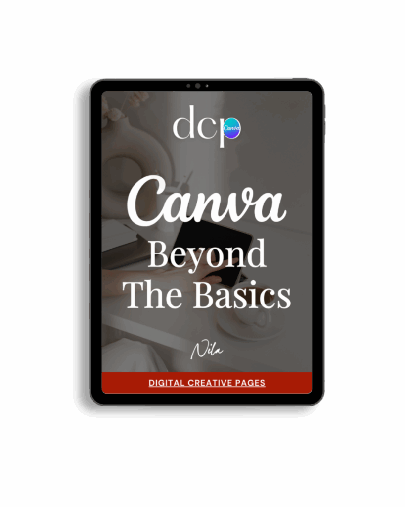
If you’re ready to move beyond basic designs and unlock Canva’s most powerful features, my book Canva – Beyond the Basics is for you.
Learn advanced workflows, time-saving hacks, and features like brand templates that busy entrepreneurs need to create professional content faster. It’s designed for anyone who wants to work smarter, not harder.
TEMPLATES FOR ENTREPRENEURS
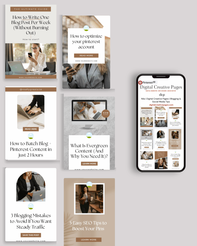
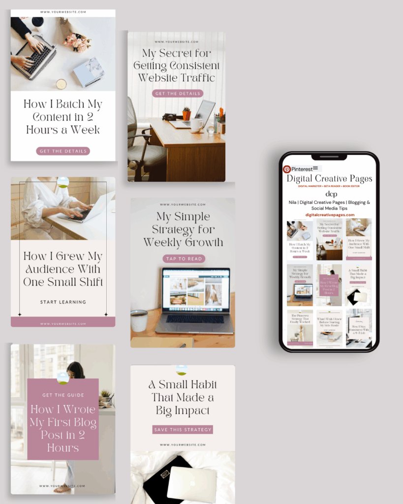
No time to design from scratch? My Pinterest Templates are created with strategy, structure, and your brand in mind.
Pick your style: Modern Minimalist | Soft Storytelling | Entrepreneur-Friendly Layouts
Get them here → DCP Shop
My INTRODUCER post – check out why I chose Showit as my website builder here
Use my code DCP to get one 1.5 months free on Showit
Get all the resources for your social media and digital marketing without breaking the bank from my DCP Shop here
By signing up for my freebies, you are agreeing that I can use your email address to market to you. You can unsubscribe from marketing emails at any time by using the link in my emails.
Previous post
next post
Search + Enter
meet nila
Hi. I am
Nila
Beta reader, book editor, Pinterest manager, Showit VA
I’m a beta reader and book editor and PA for authors, specializing in story clarity and developmental feedback. I run a sustainable online business that keeps working for me 24/7.
Along with this, I offer Pinterest management for overwhelmed creatives and entrepreneurs and set up and customize Showit templates when the tech side gets too overwhelming.
My Shop
Buy now
i need it
Free Stuff
get the goods
check it out
My Favorites
apps + Tools
Yes, please
Handpicked Links
Excited to get started? Me too!
i can't wait to
Connect with you
Let's discuss how best I can help you and your business
find your way around
about
for authors
Showit
shop
Blog
freebies
Contact
elsewhere
X
Copyright © 2024 - 2026 Digital Creative Pages | All Rights Reserved | Terms & Conditions | Privacy Policy
Website Template by Digital Creative Pages.
Photos by Styled Stock Society
Subscribe here for weekly Canva & Social Media tips and 10% off in my shop
