Introduction
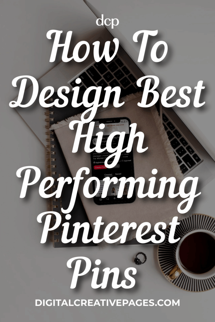
Hey there! A new blog post on first impressions. That’s what matters on social media: the hooks on Instagram and pin impressions on Pinterest that capture attention. Your pins have less than a second to impress in a feed filled with sponsored content. Make that nanosecond count. But how to design high performing Pinterest Pins
As a beginner, many don’t know what pins this platform prefers. Some are square, some cluttered, some have fonts requiring zoomed pictures. Too difficult for readers.
Here are key points to act on in every pin: ratios, fonts, overlays, contrast. Most important? Mobile readability. Ever seen anyone not glued to their phone? They’re rare now.
These are tried and tested methods I’ve used in my pins, following Pinterest’s guidelines.
Pin this on your boards
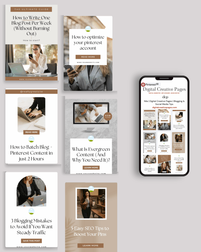
1. Go Vertical – 2:3 Ratio is King
Stick with 2:3 ratio. The app showcases tall pins only. This platform works best with 2:3 aspect ratio (1000 x 1500 pixels). This size takes enough vertical space to stand out without getting cut off.
Anything wider or shorter blends into the feed. Images exceeding 1:2.1 get cropped. Cropped images rarely get clicks—they’re lost in the scroll. 2:3 works best because it displays completely on desktop and mobile. Shorter pics get lost, taller pics get truncated.
I’ve used super tall pins for video pins (reposts from Instagram Reels) or image pins created directly on Pinterest. They work well when done directly on Pinterest. Pinterest rewards time spent on its app.
Pro tip: If using tall pins, align headlines and CTAs in the middle so they’re visible even when the bottom gets cut off. My strategy: create normal 2:3 pins followed by long video/idea pins. For my account, they lead to more saves and clicks. Check your analytics to see what works.
Want easy, practical content tips to grow your business? Join my weekly email list for Canva tricks, new social media updates, and simple strategies that actually work.
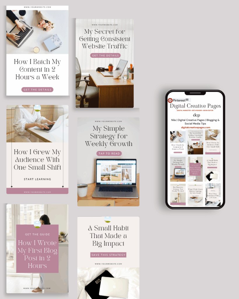
2. Go Bold with Fonts
Your pin’s purpose is capturing eyeballs within a second. If your audience can’t read your headline, no clicks happen. Fonts must be easily readable. Industry preference: sans-serif fonts like Roboto, Montserrat, Poppins, Helvetica.
Professional font tips:
- Legibility over style: Fancy scripts look pretty but are difficult to read on mobile screens. Use script fonts only for accent words, never main keywords. Use bold, brightly colored fonts for headlines.
- Limit font variety: Maximum 2-3 fonts. Personally, I use two—one sans-serif, one script. Script fonts are always big and bold with letter spacing.
- Stay consistent: Font consistency across pins reinforces brand identity and keeps designs clean.
- Size matters: I used moderate fonts previously, but analytics showed they didn’t work. Now I use big, bright fonts. Most people use Pinterest on phones—large text prevents zooming.
- Test on mobile: Always test designs on your phone or use templates for guidance.
3. Keep Headlines to 5-7 Words Max
Five words or less attracts more attention. Text overlay forms your killer sales pitch.
Remember clicking pins with unattractive descriptions? Almost never happens. With shrinking attention spans, people scan headlines instantly.
Hook them in split seconds:
- Write 5 words or less
- Large font size for readability
- Include SEO keywords: “30 Minute Meals” or “DIY Closet Makeover”
- Headlines should answer what readers want
- Numbers, how-to, power words grab attention
- Keep it short and beneficial
Your pin graphic is the introduction; description is the main body.
Related Post – Pinterest SEO Strategy – How To Find The Best Keywords
PIN TEMPLATE CLUB
Creating consistent Pinterest graphics shouldn’t eat up your entire afternoon. That’s why I created the Pinterest Template Membership, where 15 trending, ready-to-customize templates are delivered to your inbox every month for just $9.
No more design paralysis. No more wondering what’s working on Pinterest right now. I research the trends, you get the templates.
Join the membership for $9/month → HERE
🎁 Want 5 Free Pinterest Templates?
Not sure if templates are for you? Grab 5 of my trending Pinterest designs (fully editable in Canva) and test them out. Completely free.
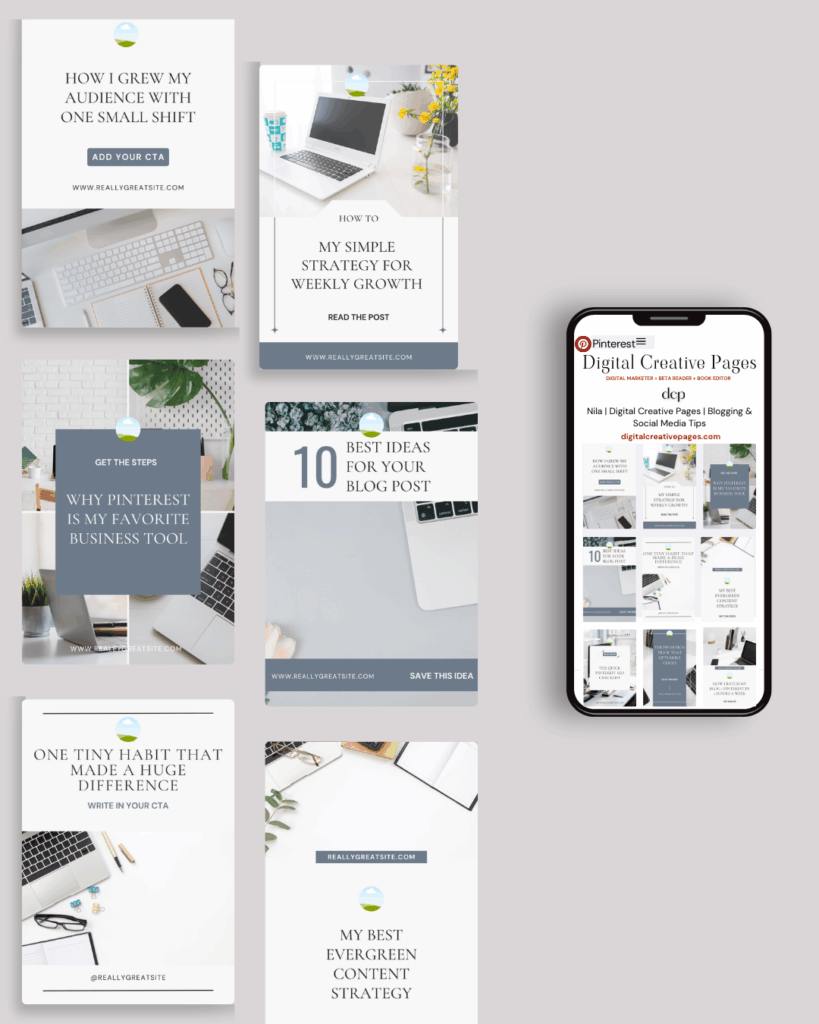
4. Make Colors Pop
Dark overlay with off-white or light pink text creates great color combinations. Vice versa works too. Light and dark contrast makes headlines readable and highly clickable.
Bold fonts and contrasting colors should highlight your pin. They make words stand out during fast scrolling.
Color strategy:
- Check competitor colors or your feed colors
- Notice what attracts you in your feed
- Use Coolors website for good combinations
- Start with light pink on dark overlay or off-white on dark overlay
- Use WebAIM contrast checker for readability standards
Most experts suggest brand colors—that’s great. But that didn’t work for me. I get bored with same colors, so my pins use various colors now.
Save this pin for later
5. Design for Mobile First
Last quarter I used medium fonts with average readability. Result? Few clicks or saves. My advice: think mobile screen when designing pins. Large fonts and high contrast readable on average mobile screens.
I used to place headlines at the bottom—I advise against this now. Place at top or middle where it’s not cut off and immediately visible.
Mobile optimization tips:
- Keep space between elements for organization
- Don’t cram too much content
- Write CTAs in descriptions
- Download pins from Canva to your phone to preview before publishing
6. Create Visual Hierarchy
When starting, I was told to add headline, tagline, logo, and blog URL. This left no space for large headlines.
This year I’m seeing minimalism—pins avoiding clutter. Most follow “less is more.” Too many elements overwhelm readers and make headlines unreadable.
Simple hierarchy steps:
- Single focus: One headline with 5-6 words, avoid taglines. Most don’t even write CTAs. Multiple points need multiple pins.
- Give headlines space: White space around headlines draws eyes and improves pin appearance.
- Emphasize keywords: Increase keyword font size, color, and weight. Emphasized keywords capture viewer attention.
- Maintain visual flow: If multiple elements exist, maintain hierarchy directing eyes from headline to tagline to CTA.
Related Post – How Many Pinterest Boards Should You Have For Your Business
7. Strategic Image Use
When starting, everyone said use images as background or focal points. Now I find many pins without images perform extremely well. Image importance depends on niche.
Food or interior decor businesses need image focus. Finance or entrepreneurship makes imagery less important than headlines. My pins with tiny picture cutouts perform extremely well.
Image guidelines:
- Quality matters: Use high-resolution, sharp images. Blurred pictures don’t work.
- Zoom strategically: Close-ups of food and decor are more enticing than wide shots lacking detail.
- Handle busy images: Use Canva to grab key elements, highlight with black/white outlines.
- Background choices: Simple colored backgrounds don’t compete with text. For busy images, decrease transparency or blur so headlines stand out.
- Use negative space: Position main elements off-center, leaving space for headlines to gain spotlight.
- Stay consistent: Having logos and website URLs makes pins distinctive, but I found strict consistency didn’t work for me.
8. Call to Action Strategy
This varies for me because my pins no longer have CTAs. I put them in descriptions if I remember.
I believe if pins answer audience questions, they’ll know to tap for complete answers via blog posts or products.
CTA testing:
- Make pins with and without CTAs
- Check analytics after a month
- See which brings more saves, clicks, and engagement
- CTAs like “tap to read full post” or “save this idea” can go at bottom
- Integrate in buttons or banners to stand out
- Avoid clutter
- Single request: “read now”—don’t say “read now and save later”
- Keep CTAs simple but precise
Related Post – How To Make Money On Pinterest For Beginners
Need Pinterest keywords that actually work?
Stop guessing. I’ll research 30 SEO keywords for your niche – the words/phrases people are searching for on Pinterest right now.
You fill out a quick form (niche, content type, blog posts), I do the research, and you get a keyword list in 7 days. Use them in your pins, titles, and descriptions.
$27. Simple.
Request your keywords → HERE
How I Do It: My Pin Creation Process
-
Start with keyword research using methods from my Pinterest SEO post
-
Choose 2:3 ratio template in Canva (1000x1500px)
-
Write 5-word headline incorporating main keyword
-
Select 2 fonts maximum: one bold sans-serif, one accent script
-
Test color contrast ensuring mobile readability
-
Position headline at top or middle, never bottom
-
Add minimal imagery if needed for niche (food/decor)
-
Create white space around key elements
-
Preview on mobile before publishing
-
Skip CTA on graphic, add to description instead
-
Maintain visual hierarchy with largest text for headlines
-
Export and test across different devices
Ready to take your Pinterest strategy to the next level but don’t have the time?
As an experienced Pinterest manager, I help busy entrepreneurs and content creators grow their traffic and sales through strategic Pinterest marketing. From keyword-optimized pin creation to board management and analytics tracking, I handle the technical details so you can focus on your business.
If you’re ready to transform your Pinterest presence without the overwhelm, let’s chat about how my Pinterest Management Services can work for you. Learn more about my services to get started.
Wrapping It Up
Making great pins is pure strategy. Follow these basic steps to balance visual appeal with clarity and organization.
Make tall vertical pins with 2:3 ratio, bold fonts that are easy to read. Keep headlines short, make pins colorful, avoid clutter, maintain hierarchy. Give elements space to breathe—add white space around headlines so eyes are drawn to them. Pins should be easily readable on both mobile and desktop.
Remember: your pin has one job—stop the scroll and get the click. Everything else is secondary.
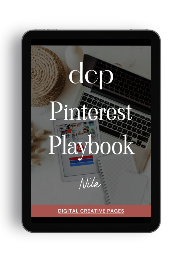
Need a Pinterest strategy that actually works?
The Pinterest Playbook covers everything: how to set up your account, SEO keyword research, algorithm secrets, where to add the keywords, what kind of pins to make.
It’s the complete guide I wish I had when I started. Just 84 pages of what works.
$27 → Get the playbook
Quick Tips Summary
Pin Mobile Optimization
- 80% of users are on mobile
- Go Vertical: 1000 × 1500px is the sweet spot
- Anything wider gets cut off. Taller images (2000px) perform great for impressions
- Bold, Clear Fonts: No thin scripts. Stick with sans-serif and make text pop against background
- Limit Words: Aim for 5 words max in overlay. Save details for description
- High Contrast: Light text on dark background (or vice versa) stops the scroll
- White on black if you’re not confident with colors yet
- Zoom Into Photos so audience sees details from distance
Loved This Post? Save It for Later!
And hey—if this post helped you, don’t forget to pin it to one of your boards so you can revisit it anytime. And more small business owners and creators can discover these helpful tips. Every save and share genuinely supports my work, and I’m grateful for it! Thank you!
TEMPLATES FOR ENTREPRENEURS
No time to design from scratch? My Pinterest Templates are created with strategy, structure, and your brand in mind.
Pick your style: Modern Minimalist | Soft Storytelling | Entrepreneur-Friendly Layouts
Get them here → DCP Shop → $5
MY TOP POSTS
My INTRODUCER post – check out why I chose Showit as my website builder here
Use my code DCP to get one 1.5 months free on Showit
Get all the resources for your online business growth and Pinterest marketing without breaking the bank from my DCP Shop here
By signing up for my freebies, you are agreeing that I can use your email address to market to you. You can unsubscribe from marketing emails at any time by using the link in my emails.
Previous post
next post
Search + Enter

meet nila

Hi. I am
Nila
Beta reader, book editor, Pinterest manager, Showit VA
I’m a beta reader and book editor and PA for authors, specializing in story clarity and developmental feedback. I run a sustainable online business that keeps working for me 24/7.
Along with this, I offer Pinterest management for overwhelmed creatives and entrepreneurs and set up and customize Showit templates when the tech side gets too overwhelming.
")
My Shop
Buy now
i need it
")
Free Stuff
get the goods
check it out
")
My Favorites
apps + Tools
Yes, please
 (1)")

 (1)")
